JUXTA · Logo Banner

My Introduction to Creative Practice Research

Starting CIM417 has made me slow down and really look at how and why I create. Until now I have often worked on instinct, led by ideas, visuals and emotion, but this unit is about pausing long enough to question what sits underneath all of that.

My goal with this work is to dig deeper into my process, connect it to research, and build things with more intention behind them. I want to use this space to test ideas, challenge my usual habits, and explore how design can work as both creative expression and a way of thinking.

Throughout this journal I will be reflecting on my own practices through the lens of two projects I am deeply involved in: Navigating Hope and ZaZa’s Legacy. These projects give me real-world contexts where my design decisions carry weight, and they provide the ground for me to examine how theory, research and practice come together in my work.

Navigating Hope: A trauma-informed mobile tool I designed to help people in crisis quickly find food, shelter, health care and local support. It focuses on clear language, low cognitive load and predictable navigation so it feels safe and usable for people under stress.

ZaZa’s Legacy: A community organisation dedicated to choking prevention and awareness, founded in memory of Zaire “ZaZa” Bwoga. As Design & Marketing Director, I work on trauma-informed communication and visuals that honour families, raise awareness, and build safer communities.

By reflecting on my involvement in both projects, I aim to surface the habits, assumptions and values that guide my practice, and to explore how creative practice research can help me grow into a more thoughtful and adaptable designer.

AI Use Declaration
ChatGPT was used to spell-check, format, and identify errors in this document. Images created with ChatGPT are cited in the image captions.
Artist Statement — JUXTA
CIM416 · Reflective Journal

Artist Statement — Lana Webster

Author: Lana Webster

Design is my way of building the future I want to see.

It’s where creativity, strategy, and social impact meet, a space where ideas become stories, and stories create change.

Every project begins with listening, understanding the human, cultural, and environmental layers before a single design decision is made.

Whether it’s a brand identity, a digital experience, or a community campaign, my focus is on turning complex challenges into clear, engaging visuals that people connect with. I’m drawn to projects that challenge the status quo and help brands, communities, and causes lead the change they believe in.

Guided by design thinking, behavioural insights, and lived experience, my work often engages with issues such as social justice, sustainability, and community resilience. For me, design is more than a skill, it’s how I help build the future I want to see.

Portfolio · Artist Statement

Selected Works

CIM417 · Reading Reflection — JUXTA
CIM417 · Reading Reflection

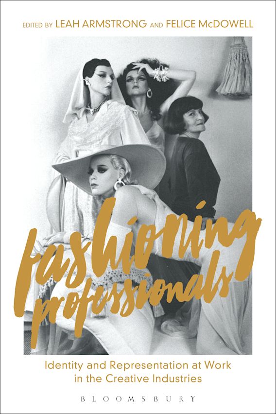
Fashioning Professionals — Reflection

Author: Lana Webster
Book cover: Fashioning Professionals
Figure. Fashioning Professionals book cover. Bloomsbury Publishing, 2018. Source: Publisher image.

One thing this chapter really brought home for me is that identity in creative work is never fixed. Armstrong and McDowell (2018) talk about how it is always shifting, shaped by the social, cultural and economic forces around us (p. 2). They describe this as fashioning, “to do and to make”, which helped me see identity as something we build as we go, rather than something we just have.

That made sense to me because my own identity changes depending on where I am and who I am working with. In professional settings, I am more structured, careful with my words and focused on outcomes. But when I am making personal art, I work from instinct, following colour, emotion and imagination without worrying about how it will be received. Neither version is fake; they are just different parts of me. Realising that this shifting is normal has helped me see it less as being inconsistent and more as being adaptable. It also made me think about how limiting it would be to only show up as one version of myself all the time. Giving myself permission to move between these different ways of working feels like a strength, not a flaw.

The chapter shows how my idea of being professional was formed. Armstrong and McDowell (2018) explain how traditional ideas of professionalism are rooted in systems like class, education, gender expectations and institutional norms (pp. 5–6). I can feel those influences in me. As someone from a working class background, I often feel slightly out of place in formal or corporate spaces, like I have stepped into someone else’s world. My values of fairness, care and inclusion are tied to that upbringing, and they do not always sit comfortably with the detached efficiency that is often expected. It made me realise that what I see as professional is not neutral; it is shaped by my history and by what matters to me.

Armstrong and McDowell (2018) also talk about how identity is not just about what you do, but how you present yourself. They say style, self-presentation and even aesthetic choices are part of how identity gets recognised and performed (pp. 10–11). I notice this in how different I feel between my personal art and my professional work. In my art, I let go of structure and follow emotion. In professional spaces, I am more selective about what I show. This chapter showed me how much of identity-building is intentional. It does not just happen; we shape it through the choices we make about how to show up.

Another point that stuck with me was that identity is not only shaped by me. The editors talk about how it is also shaped externally, through media, institutions and public perception (Armstrong & McDowell, 2018, p. 15). That made me think about how different people can interpret the same work in completely different ways. Something deeply personal to me might be seen as purely decorative or technical by others. It reminded me that identity is not just about how I see myself; it is also built through how others choose to frame or represent me.

Pulling all this together, what I have taken from this chapter is that creative identity is not something you find once and hold onto; it is something you keep shaping. It is fluid, and it shifts as your work, values and context change. For me, this means being more deliberate about what I carry forward. I get to choose which parts of my personal world, such as motherhood, activism, art, design thinking and social change, I want to keep at the centre of my professional one. Knowing how much identity is influenced by the systems and stories around us (Armstrong & McDowell, 2018) helps me stay flexible while still holding onto what matters most to me.

Reading reflection · CIM417

References

  1. Armstrong, L., & McDowell, F. (2018). Introduction. In L. Armstrong & F. McDowell (Eds.), Fashioning professionals: Identity and representation at work in the creative industries. Bloomsbury Publishing.
CIM417 · Week 2 Activity — JUXTA
CIM417 · Week 2 Activity

Annotated Bibliography — Reflections

Author: Lana Webster
Unit: CIM417

Reference

Edelman, N. (2023). Doing trauma-informed work in a trauma-informed way: Understanding difficulties and finding solutions. Health Expectations, 26(6), 2158–2165. https://doi.org/10.1111/hex.13817

Annotation

Edelman explores how trauma-informed practice (TIP) can fall short when the way it is taught or delivered does not reflect trauma-informed principles. The article highlights issues such as the careless use of the word "trauma," confusion between TIP and trauma-enhanced practice, assumptions that survivors are not present, and safety measures that are too limited. For example, in professional or academic settings, discussions about trauma are often framed as if survivors are an abstract "other," when in reality they are frequently in the room. Edelman argues that TIP must "model the model," meaning the way workshops, trainings, or meetings are run should reflect the same principles of safety, trust, and inclusion that TIP is based on.

Reflections on article

Edelman's article reminded me that trauma is not just about what happens on the outside, but how unsafe a person feels on the inside afterwards. Doing trauma-informed work means creating spaces where people do not have to carry fear or brace themselves to participate. It means using words with care, putting real safety measures in place, and always assuming that someone in the room may be holding invisible experiences. I also reflected on the phrase "we all have trauma." It can blur the difference between everyday stress and the deep impact of traumatic stress. At the same time, each person experiences distress differently, and compassion means respecting that. I prefer to say that we all face distress, but trauma affects each of us in unique ways. This helps me honour the weight of trauma while recognising the diversity of human experience.

Reference

Braaf, S., Ameratunga, S., Nunn, A., Christie, N., Teague, W., Judson, R., & Gabbe, B. J. (2018). Patient-identified information and communication needs in the context of major trauma. BMC Health Services Research, 18(1), 163. https://doi.org/10.1186/s12913-018-2971-7

Annotation

This article examines how people with serious injuries experienced communication with doctors, nurses, and other health professionals during the first three years after their accident. Interviews with 65 patients revealed confusion caused by inconsistent information and the use of medical jargon. Patients wanted clearer explanations, written notes, and one key person to help organise their care. They valued empathy, plain language, and being listened to. The study suggests practical solutions such as written discharge plans, simple wording instead of jargon, and the use of case managers to coordinate information.

Reflections on article

Braaf et al. (2018) showed me how easily people can feel excluded when communication is confusing, inconsistent, or filled with jargon. This connected strongly with my work on Navigating Hope, where audience testing revealed the same problem in a different context. Users were able to navigate the app, but one community service worker suggested even simpler words so that nothing could be misinterpreted. That feedback echoed the article's point about patient-centred communication: small changes in language or design can make the difference between people feeling supported or shut out. It reinforced my role as a designer to strip away barriers, keep things human, and create tools that help people connect with support when they need it most.

Reference

Liu, C. H., Jones, R. N., & Han, S. D. (2022). Measuring the impact of trauma exposure on health outcomes among older adults: A scoping review. International Journal of Environmental Research and Public Health, 19(14), 8437. https://doi.org/10.3390/ijerph19148437

Annotation

This scoping review explores how trauma exposure affects the health of older adults. It brings together research showing trauma's long-lasting impacts, including higher risks of depression, anxiety, chronic illness, and cognitive decline. The authors note that trauma is often overlooked in research on older adults, which means health issues may be misinterpreted or untreated. They also highlight inconsistencies in how trauma is measured across studies, making comparisons difficult. The review calls for better tools and more consistent, trauma-informed approaches in both research and health care for older populations.

Reflections on article

Liu et al. (2022) reminded me that trauma does not simply fade with time. It can shape health and experiences for decades. Although the review focuses on older adults, the lesson applies to design as well. If systems do not account for trauma, people are left behind. When creating Navigating Hope, this idea stayed with me. Audience testing showed how important it was to use clear, simple language so users did not feel overwhelmed. This article reinforced why trauma-informed design matters. It is not only about ease of use in the moment, but about respecting people's histories and reducing the risk of retraumatisation. It also reminded me to keep going deeper. In future projects, I want every stage of the design process, from testing through to long-term use, to reflect safety, trust, and respect.

Reference

Rodaughan, J., Murrup-Stewart, C., & Berger, E. (2024). Aboriginal practitioners' perspectives on culturally informed practice for trauma healing in Australia. The Counseling Psychologist, 52(7). https://doi.org/10.1177/00110000241268798

Annotation

This article explores how Aboriginal practitioners in Australia understand and deliver culturally informed trauma healing. Through qualitative interviews, the authors show that trauma cannot be separated from colonisation, systemic racism, and intergenerational loss. Practitioners explained that real healing needs to be grounded in Indigenous worldviews, values, and community relationships. They spoke about how connection to culture, land, and kinship are not just important, but vital to protecting and restoring wellbeing. The article also challenges Western trauma frameworks that ignore these layers and risk causing harm by overlooking context. By putting Aboriginal practitioners' voices at the centre, the study calls for trauma healing that honours culture, history, and sovereignty.

Reflections on article

Reading Rodaughan et al. (2024) really moved me. It reminded me that trauma-informed practice cannot just be about broad principles, it has to be rooted in culture and community. For Aboriginal people, healing is not only about the individual but about repairing.connections to land, kin, and cultural knowledge that have been broken by colonisation. That perspective made me stop and think about my own work. Navigating Hope was built with trauma-informed design in mind, but this article pushed me to ask whether that is truly enough without being culturally safe and community-led. It is not only about using clear language or reducing overwhelm, it is about ensuring the design process itself respects and reflects the lived knowledge of communities. This article left me with a clear message: trauma-informed design that does not hold cultural respect at its core risks repeating the very harms it sets out to heal.

Annotated Bibliography · CIM417
CIM417 · Reading Reflection — JUXTA
CIM417 · Reading Reflection

Vonnegut’s Story Shapes: Reflection

Author: Lana Webster
Kurt Vonnegut’s diagram of the shapes of stories
Figure. Johnson, S. (2022, June 14). Kurt Vonnegut on the 8 “shapes” of stories. Big Think. Source: https://bigthink.com/high-culture/vonnegut-shapes/.

Kurt Vonnegut argued that many stories follow simple, repeatable shapes that you can plot on a graph. The vertical axis shows good or bad fortune, and the horizontal axis shows time. He mapped patterns like “man in a hole,” where things get worse then improve, and “boy meets girl,” with ups and downs before a resolution. He once pitched this as a thesis and it was rejected for being too simple and too fun, but the idea stuck because it helps us see structure. He also admitted that great works do not always fit the model. For example, Hamlet resists a clean up or down line. His final note is human. Notice small good moments when they happen. If this is not nice, what is.

What makes Vonnegut’s idea stick is not only the simplicity. It is that he turned stories into something you can see. The shapes act like a visual shorthand for rhythm: rise, fall, recovery. They do not box you in. They give you a map to work with. For me, that is the hook. It shows how even messy, human experiences can be sketched into patterns that help us design clearer, more meaningful journeys.

What struck me most is how much people look for a sense of shape in their experiences. We want a clear arc: setup, friction, clarity, and resolution. Vonnegut’s idea is a good lens for mapping user journeys, but lived experiences rarely run in straight lines. In trauma-informed contexts especially, journeys can loop, stall, or branch. My role as a designer is not to force them into a curve but to make the rough patches less damaging and the high points easier to recognise. That means using simple language, predictable flows, and safe exits, while also creating space for pauses where users can catch their breath.

With Navigating Hope, this translates into some non-negotiables. Decision points must be clear and light on cognitive load. If something goes wrong, the way back should be obvious and safe. Progress should be shown in small, honest increments, not exaggerated leaps. And throughout, the design needs to prompt people to notice what went right, not just what comes next. In this way, the story shape becomes a service shape: not a piece of fiction, but a real-world narrative that helps people feel supported rather than tested.

Reading reflection · CIM417

References

  1. Johnson, S. (2022, June 14). Kurt Vonnegut on the 8 “shapes” of stories. Big Think. https://bigthink.com/high-culture/vonnegut-shapes/
CIM417 · Reading Reflection: JUXTA
CIM417 · Reading Reflection

Beyond the Hero’s Journey: Reflection

Author: Lana Webster

Steve Seager’s article Beyond the Hero’s Journey challenges the idea that Joseph Campbell’s model is a one size fits all solution. He separates plot and story. Plot is what happens. Story is how we tell it, shaped by people, culture, and context, so one template cannot serve every setting (Seager, 2015).

He also highlights four other narrative patterns. Scandinavian forms circle back to shared truths with multiple characters. Indian forms hold many threads and emotions at once. Central African forms centre environment, spirituality, and community over the lone individual. Autochthonous forms keep meaning open for audiences to assemble. These are examples that help us notice structure before we design the telling (Seager, 2015).

This landed for me. I see the Hero’s Journey flatten people’s lives when it is forced into social work. Real stories loop, pause, and rebuild. Sometimes making it through the day is the win.

Seager’s split helps my practice. Plot is the backbone. Story is how different audiences move through that backbone. For Navigating Hope, a lone hero frame does not make sense. Community, safety, and place do. That sits close to the Central African shape where environment and collective wellbeing lead.

On the service side, there is a Scandinavian rhythm. Providers and volunteers meet at checkpoints, share truths, then move again. Public advocacy can borrow from the Indian approach, weaving emotion, policy, and lived voice without dumbing it down.

Operationally, I will lock the plot first, then adapt the story per audience. For people in crisis, reduce cognitive load and centre nearby, practical help. For providers and councils, show shared checkpoints and interfaces for collaboration. For the public, hold multiple voices across short and long formats so the message stays honest and dignified.

I will also test for narrative comfort, not just usability. Do people want clear steps or open maps. Do they lean toward community focus or personal agency. Do they want closure or ongoing paths. These signals drive trust and follow through.

Bottom line. This is not anti structure. It is pro fit. Build a strong backbone, then let the story breathe across culture, channel, and moment.

Reading reflection · CIM417

References

  1. Seager, S. (2015, July 2). Beyond the Hero’s Journey: Four innovative models for digital story design. steveseager.com. https://www.steveseager.com/heros-journey-four-innovative-narrative-models-digital-story-design/
CIM417 · Reading Reflection: JUXTA
CIM417 · Reading Reflection

Brady on Exegesis: Reflection

Author: Lana Webster

Tess Brady reframes the exegesis as a companion to the creative work rather than a defensive essay. The creative piece should stand on its own, and the exegesis should add value by tracing context, ideas, and process (Brady, 2000, p. 6).

She uses the bowerbird to describe creative research. Like the bird, we collect fragments from many places and shape them into something new. Brady links this to practice through gathering and shaping as core moves that turn scattered material into meaning (Brady, 2000, p. 2).

Brady also critiques the habit of writing exegeses only for examiners. She argues they should be readable and useful so they contribute beyond assessment to wider conversations. She notes examiner language around "publishable standard," but clarifies that publishable refers to quality and contribution rather than commercial uptake (Brady, 2000, pp. 4, 6).

Reading Brady felt like permission to breathe. She reminds me the exegesis is not a defence but a companion to the work, a place to pause, think, and make sense of what the project has taught me (Brady, 2000, p. 6). That shift makes the writing feel alive rather than forced, closer to real practice.

The bowerbird metaphor clicked straight away. My process can look chaotic from the outside - colours, textures, quotes, photos, and lived moments spread out - but it follows a rhythm. I gather, reflect, and shape until the pieces sit right. Brady's framing validates that this mess is method, and that gathering and shaping are part of how meaning is built (Brady, 2000, p. 2).

What really landed with me was Brady's challenge to write for more than the examiner. It made me think about who I am speaking to when I reflect. I do not want my exegesis to sit quietly in a digital archive. I want it to be useful, to reach others who might be wrestling with the same questions. That intention aligns with how I approach community-focused design - creating work that connects, informs, and lasts beyond the assessment stage (Brady, 2000, p. 6).

In practice, this means letting the creative piece breathe on its own and using the exegesis to show the thought behind it - the risks I took, the ethical choices I made, and the reasoning that shaped my direction. I see it as an open conversation, not a justification. It is a way of documenting growth, choices, and care for the people who might one day read it (Brady, 2000, p. 6).

Most of all, Brady's view helps me see the exegesis as a living companion. It holds the why and the how in my voice and makes space for honesty and empathy in creative reflection (Brady, 2000, p. 8).

Reading reflection · CIM417

Activity

The use of descriptive prose within this exegetical work, in particular the bowerbird motif: The bowerbird makes the process easy to picture. It captures how researchers collect scraps and arrange them into meaning. It is vivid and it sticks (Brady, 2000, p. 2).

Two parts of the creative process Brady identifies: Gathering, which is selecting and collecting fragments, references, and ideas, and Shaping, which is arranging and reworking them until they form a coherent whole (Brady, 2000, p. 2).

References

  1. Brady, T. (2000). A question of genre: De-mystifying the exegesis. TEXT: Journal of Writing and Writing Courses, 4(1), 1–9. https://doi.org/10.52086/001c.35896
CIM416 · Reflective Journal · Week 3 — Bricolage Activity
CIM416 · Reflective Journal

Week 3 · Bricolage Activity

Author: Lana Webster

This week’s activity focused on bricolage, or what Pamela Greet calls bowerbirding, the practice of selecting and arranging found fragments with intent (Greet, 2017, p. 188). The idea is simple and useful: notice the scraps around you, images, words, fragments of thought, and gather them under a clear theme. Like the bowerbird searching for blue, choose a thread that pulls everything into one small nest of meaning (Greet, 2017, p. 188).

What I liked most was the permission to work with what is already here. Greet frames the writer’s job as deep attention to the overlooked details of ordinary life, the small signals most people miss, and then arranging them so new meaning can emerge (Greet, 2017, p. 185). That set the tone for how I built my own bricolage and how I read Christopher’s. It was not about a polished argument. It was about gathering fragments and letting them speak to each other.


Bricolage - Men's Grief
Figure. My bricolage on men’s grief - image of Brian, ZaZa’s Legacy founder. Source: ZaZa’s Legacy.


My Bricolage

For my bricolage, I chose men’s grief as the thread that ties everything together. Like the bowerbird, I selected three strong pieces: lived experience, scholarly research, and my own narrative voice. The act of choosing and arranging these fragments is the heart of bowerbirding (Greet, 2017, p. 188).

The first element is the image of Brian, founder of ZaZa’s Legacy, leaning into the car that carries his son’s coffin. It is an intimate moment of grief, showing how loss can be carried in the body as much as in words. This visual anchors the work in lived experience and reminds me that grief is always more than theory.

The second element is an excerpt that considers how cultural expectations shape the ways men and women express or hold grief, and whether those differences are socially constructed or real (Stelzer et al., 2019). Including this gives context, showing that what we witness in Brian’s image is not only personal but also shaped by wider narratives.

The third element is a line from my own blog on ZaZa’s Legacy:

Men’s grief is not weakness. It is love in its rawest, most powerful form. And it is time we treated it that way.

This was written in response to reflections shared through my surveys. It tries to reframe grief not as silence or fragility, but as love that continues to endure. It follows Greet’s invitation to notice what is already present and give it a clearer shape through arrangement and selection (Greet, 2017, p. 187).

Placed together, the three pieces become a small conversation: grief as lived, grief as studied, and grief as reframed. The strength comes from the way the fragments lean on each other, which is exactly how bowerbirding produces meaning (Greet, 2017, p. 188).


Bricolage - AI Dystopia
Figure.
Christopher Wesley’s bricolage - AI imagined as collapse and hope. Source: Class activity.


Christopher Wesley’s Bricolage

Christopher’s bricolage explores AI and the mix of fear and hope that comes with it. The ruined cityscape feels like a warning about what can happen when technology runs past care. On that image he placed the line, If it can be dreamed, it can be done. On its own it reads as encouragement, but against collapse it turns the message and asks harder questions.

At the bottom he added a second quote from Lord of the Rings: Have patience. Go where you must go, and hope! That softens the scene into guidance. It suggests a way to live through uncertainty without giving up.

Read through Greet’s lens, Christopher is doing clear bowerbirding: gathering a strong image and two short texts, then arranging them so the pieces amplify and complicate each other. The meaning comes from the placement and the relationship between parts, not from any single element (Greet, 2017, p. 188). Seeing his work made me check my own optimism about AI and remember to hold both hope and concern at the same time.

Peer bricolage reflection · Week 3

References

  1. Greet, P. (2017). Writer as perv: Bricolage, bowerbirding, observation. New Writing: The International Journal for the Practice and Theory of Creative Writing, 14(2), 184–195. https://doi.org/10.1080/14790726.2016.1223142
  2. Stelzer, E.-M., Atkinson, C., O’Connor, M.-F., & Croft, A. (2019). Gender differences in grief narrative construction: A myth or reality? European Journal of Psychotraumatology, 10(1), 1688130. https://doi.org/10.1080/20008198.2019.1688130
  3. Webster, L. (2025, October 1). When men grieve: Stories of love, loss, and the courage to heal. ZaZa’s Legacy. https://zazaslegacy.org.au/when-men-grieve-stories-of-love-loss-and-the-courage-to-heal/
CIM417 · Reflective Journal · Week 4 — Knowing Through Design
CIM417 · Reflective Journal

Week 4 · Knowing Through Design

Author: Lana Webster

Stokes traces four ways of knowing that shape media and cultural studies, from story and rhetoric to empiricism and critical readings of power. The point is not to pick a side, but to understand the ground you are standing on (Stokes, 2013, pp. 3–24).

She also revisits Aristotle's trio of ethos, pathos and logos as a simple, durable frame for judging arguments and building our own (Stokes, 2013, pp. 11–13).

Ethos

Trust sits behind the work. Be transparent, own decisions, keep the bar high for integrity.

Pathos

Feeling helps people care. Use empathy and restraint so audiences feel seen, not pushed.

Logos

Logic keeps it standing. Clear structure, clear reasons, and evidence that stacks up.

This chapter helped me slow down. There is no neutral stance. Every colour, word and layout choice comes from a way of knowing. Naming that makes me more deliberate and kinder in how I design.

Ethos. Trust first. I will be open about choices and limits. Credibility is not just talent, it is integrity.

Pathos. Feeling belongs. I want people to feel seen without being overwhelmed. Good story and tone can hold complexity instead of flattening it.

Logos. Clarity is kindness. Claims, reasons and evidence should line up in a structure others can trace.

Bottom line. I will choose methods that fit the question and the frame I am using, and I will only mix approaches when each one adds clear value.

References

  1. Stokes, J. C. (2013). How to do media and cultural studies (2nd ed.). SAGE Publications.
Reading reflection · Week 4
CIM417 · Reflective Journal · Week 4 · Openness and Closure
CIM417 · Reflective Journal

Week 4 · Openness and Closure

Author: Lana Webster

Figure 1. Hilary Lawson, The world after reality (2023).

Hilary Lawson frames the world as more than we can fully grasp. He calls that ungraspable space openness, and the ways we carve meaning out of it closures. Closures are useful because they let us share and act, but they also narrow what we can notice (Lawson, 2023).

Problems start when we mistake a closure for the truth. Lawson urges us to reopen our closures, stay curious, and let fresh perspectives reshape how we see and design (Lawson, 2023).

Design lives in that dance between open and closed. I begin wide, listening and observing, then choose a direction so the work can take shape. Each choice includes and excludes. That tension keeps me intentional.

Lawson’s framing gives me permission to revisit decisions. No closure is final. Prototypes and feedback are ways of seeing again. Openness keeps the work alive, while closure makes it useful.

This balance is the heart of my practice. It helps me move between imagination and clarity, care and structure, so the outcome is not just a solution, but something meaningful.

Reference

  1. Lawson, H. (2023, May 15). The world after reality [Video]. YouTube. https://www.youtube.com/watch?v=sTdKTy-P2xM
Reading reflection · Week 4
CIM417 · Reflective Journal · Week 4 — JUXTA
CIM417 · Reflective Journal

Week 4 · Research, Knowledge, and Creative Practice

Author: Lana Webster

Getting the Words Straight

Before diving into how I use research and creative practice, I wanted to ground myself in the core ideas that shape this reflection. These terms help frame how I understand knowledge, making, and meaning in design.

Research

Structured curiosity that helps me ask better questions and stay open to being changed by the answers.

Knowledge

What remains after testing, reflection, and deciding what can be trusted. It grows and shifts as I do.

Methodology

The map I draw while walking the path. It gives structure to intuition and helps others follow my reasoning.

Epistemology

The system that decides which kinds of knowing count as valid, asking me to notice who gets to speak and who is left out.

Exegesis

The reflective writing that sits beside creative work, unpacking what the process has taught and making the learning visible.

Cards draw on Stokes for method and epistemology (2013, pp. 3–4, 16–21) and Brady for exegesis as companion text (2000, p. 6).

What Research Looks Like to Me

This week I kept returning to a simple idea: research is a process that produces knowledge. It sounds academic, but for me it's personal. Every time I observe, reflect, or rebuild something, I'm creating knowledge by noticing what happens when ideas meet people (Stokes, 2013, pp. 3–4).

When I hear the word research, I don't picture a lab or a stack of statistics. I picture sitting beside someone exploring the Navigating Hope app, seeing their relief when information feels clear and human rather than clinical or overwhelming. I picture shaping ZaZa's Legacy with Brian, choosing language that holds grief gently while still empowering. These moments don't show up in charts, yet they reveal truths about trust, emotion, and communication that guide design more meaningfully than numbers alone.

Creative Practice Research

We often treat scientific knowledge as more legitimate because it's measurable. Creative practice reveals what data can't: the felt sense of a problem, the human undercurrent. A poster can open empathy, a flow can calm anxiety, a story can repair trust. These outcomes are meaningful even when not expressed in numbers.

Creative practice lets me explore knowledge through making. I can stay open while gathering stories, then apply closure when designing something people can actually use. Openness invites discovery; closure creates clarity (Lawson, 2023).

How I Think Through Design

Design Thinking Process Diagram by Lana Webster, JUXTA Design Studio
Figure 1. Design Thinking Process, JUXTA Design Studio (2023).

Design Thinking

  • Empathise by listening without pressure and capturing exact phrases.
  • Define with plain words that people already use.
  • Ideate with openness and curiosity.
  • Prototype lightly so change stays easy.
  • Test one decision at a time and record what was learned.

Design thinking thrives on rhythm. Empathy starts the dialogue, definition gives it shape, ideation invites possibility, and testing grounds the work. It's the same rhythm I used for Navigating Hope, listening deeply, designing lightly, and refining with care.

Critical Thinking

Critical thinking balances compassion with clarity. It asks where my beliefs come from and who they might exclude. It keeps ethics alive in the process, not added at the end (Stokes, 2013, pp. 20–21, 23).

  • Question labels that add pressure or exclude.
  • Check that evidence fits the claim and state reasoning in plain terms.
  • Look for missing voices and invite them in.
Different is better banner by JUXTA Design Studio
Figure 2. Different is better — critical thinking banner, JUXTA Design Studio (2023).

The Knowledge Inside My Practice

Each project produces knowledge across different dimensions. Some are tangible, others ethical or emotional. Together they form a map of how I design for the world.

Technical

Turning ideas into working prototypes, testing flows until they're smooth, and documenting so others can build on them.

Philosophical

Exploring what safety, trust, and identity mean in context, and how design shapes the stories people tell about themselves.

Ethical

Choosing words and systems that honour consent, reduce harm, and reflect trauma-informed responsibility.

Emotional

Designing with sensitivity to tone, pacing, and colour to lower anxiety, build trust, and invite calm confidence.

Critical reflection practices align with Stokes on rules of evidence, validity and a reflective stance in inquiry frames (2013, pp. 20–21, 23).

If research is how we make knowledge, then my practice is already research. Every time I listen, test, or rebuild something, I'm learning through doing. It lives in that space between what can be measured and what can only be felt. Writing this made me realise that methodology isn't just a framework, it's a way of paying close attention to people, context, and the quiet moments that shape design decisions (Stokes, 2013, pp. 20–21, 23; Brady, 2000, p. 6). Creative practice helps me slow down and see what really matters. I want to keep making work that feels honest, grounded in care, and open enough for others to find themselves in it.

References

  1. Brady, T. (2000). A question of genre: De-mystifying the exegesis. Journal of Writing and Writing Courses, 4(1), 1–9. https://doi.org/10.52086/001c.35896
  2. Stokes, J. C. (2013). How to do media and cultural studies (2nd ed.). SAGE Publications.
  3. Lawson, H. (2023, May 15). The world after reality. YouTube. https://www.youtube.com/watch?v=sTdKTy-P2xM
Reading reflection · Week 4
CIM417 · Class Reflection

Week 5 — Representation Across Eras

Author: Lana Webster

Tarantino, Q. (2020, January 23). Quentin Tarantino on the evolution of Westerns. YouTube. https://www.youtube.com/watch?v=1RoebUgre6A

What really stood out to me in Tarantino’s reflection is how he recognises that Westerns are not simply stories about the past, but reflections of the time they were made. He explains, Westerns reflect the decade in which they were made more than musicals, more than period dramas, more than even comedies. (Tarantino, 2020). That idea captures something powerful about how art evolves with society. He describes how the Westerns of the 1950s mirrored an Eisenhower America in every way, shape, and form with their moral clarity and clean-cut heroes. By the 1970s, that confidence had been replaced with cynicism. As Tarantino puts it, filmmakers of that era took great joy in ripping the scabs off old myths, exposing the truth that characters like Billy the Kid and Jesse James were killers, absolute cold-blooded killers. (Tarantino, 2020).

I love how honestly he acknowledges this shift in perspective. When he says, You’ve got to do your version of it, it speaks to the idea that creative work only has meaning when it reflects the world we live in now. Trying to make a John Ford-style Western today, he says, would be silly because those films were made for a different America. (Tarantino, 2020). That awareness of context and audience is exactly what keeps creativity alive.

I completely agree with him. Every creative era carries its own emotional fingerprint. You can feel the pulse of a time period through its films — what people feared, what they valued, and what they questioned. While I agree that Westerns reflect their era beautifully, I believe horror might demonstrate this even more vividly. Each decade’s horror films reveal what society is afraid of. The Cold War brought stories of paranoia like Invasion of the Body Snatchers (1956). The 1970s showed consumerism and loss of innocence in films like Dawn of the Dead (1978). Today’s horror reflects the fear of isolation, identity, and technology.

There is something deeply human in what Tarantino says. His reflection reminds me that creative work is more than entertainment. It is a form of research, a mirror that captures how we see ourselves in any given moment in time.

References

  1. Tarantino, Q. (2020, January 23). Quentin Tarantino on the evolution of Westerns. YouTube. https://www.youtube.com/watch?v=1RoebUgre6A
CIM417 · Class Reflection

Week 5 — Remix Culture and Authorship

Author: Lana Webster

Michael Rennett’s article Quentin Tarantino and the Director as DJ explores how Tarantino reuses and reimagines existing material through remix culture. Rennett describes him as a DJ who “borrows sounds from older songs and combines them to create a new song through a process called ‘sampling’” (Rennett, 2012, p. 391). This comparison reframes the idea of originality as transformation rather than invention.

One line that really made me think was Paul Miller’s warning about using “too much citation, [and] not enough synthesis” (Rennett, 2012, p. 394). It made me realise how easy it is to collect inspiration without truly transforming it. In my own creative work, I often pull ideas from stories of lived experience, and this reminded me that meaning is not in the reference itself, but in how I weave it into something sincere.

I also connected with Rennett’s idea that “if a DJ is doing his job right, there has to be an element of the rebel in what he does” (p. 398). It reminded me that rebellion does not always mean breaking rules — sometimes it means challenging silence, stigma, or how people are seen. That kind of quiet rebellion, grounded in empathy, feels closest to the kind of designer I want to be.

References

  1. Rennett, M. (2012). Quentin Tarantino and the director as DJ. The Journal of Popular Culture, 45(2), 391–409. https://doi.org/10.1111/j.1540-5931.2011.00800.x
CIM417 · Class Activity · Week 5 — JUXTA
CIM417 · Class Activity

Week 5
See the Person. See the Real Problem.

Author: Lana Webster

For this class activity we were asked to write an artist statement for a hypothetical work that does not exist yet, starting with the prompt “My work explores...”. From there we had to make a fast, low fi creative piece that responds to that statement. Any medium was allowed, including posters, memes, zines or short phone videos. I used the brief to imagine a trauma informed advocacy poster series about homelessness, then created low fi AI mock ups to test the idea.

Poster Series

These low fidelity AI mockups are my quick response to the Week 5 brief, translating my artist statement into a fast poster experiment to test composition, tone, and messaging.

Poster concept from See the Person series.
Poster 1: AI generated concept from the See the Person. See the Real Problem. series
Poster concept from See the Person series.
Poster 2: AI generated concept from the See the Person. See the Real Problem. series
Poster concept from See the Person series.
Poster 3: AI generated concept from the See the Person. See the Real Problem. series

Note: low fidelity AI placeholders used to test composition and messaging. These do not depict real people. The series references the lived struggles of people experiencing homelessness.

Artist Statement

My work explores how trauma-informed visual storytelling can shift public perceptions of homelessness by centring dignity over stereotype.

See the Person. See the Real Problem. is a poster series designed to shift public perception of homelessness. Too often, people are seen through the lens of stereotypes rather than dignity and humanity. I deliberately kept the people in colour and the backgrounds in black and white, a choice that signals dignity without exploiting vulnerability. The overlays are simple and direct, aiming to provoke reflection without retraumatising audiences or subjects.

This work asks viewers to reconsider what they see and to reflect on the systemic issues that shape these struggles. Trauma-informed practices shaped this process. Rather than using sensationalist or harmful depictions, I focused on maintaining respect, empathy, and safety in every visual decision. These posters represent real and urgent struggles. They are a call to see people not as problems to be solved, but as individuals whose lives matter, whose circumstances are shaped by broader failures of housing, health, and support systems.

An example of the prompt used to create these posters:

A powerful advocacy poster. A mother and her two children sit inside an old car, their faces visible through the window. The people are in full colour to emphasise their humanity, while the background and car interior are black and white. Overlaid bold green (#a8cf3d) text in Rubrik font reads: SEE THE PERSON. SEE THE REAL PROBLEM. The style is gritty, empathetic, and documentary like.

References

  1. Webster, L. (2025). See the person. See the real problem [Poster series prototype with AI-generated placeholders]. JUXTA Design Studio. https://juxtadesignstudio.com
  2. OpenAI. (2025). ChatGPT [Large language model]. https://chat.openai.com
CIM417 · Class Activity · Week 6 — JUXTA
CIM417 · Class Activity

Duchamp vs Da Vinci — Week 6

Author: Lana Webster
Comparison of Duchamp's Fountain and Da Vinci's Mona Lisa from SAE lecture slides
Source: SAE Institute. (2025). CIM417 Week 6 lecture slides: What is art? SAE Creative Media Institute.

For me, Leonardo da Vinci's Mona Lisa and Marcel Duchamp's Fountain are both art pieces, but they serve very different purposes. The Mona Lisa demonstrates technical mastery, symbolism, and tradition. Fountain disrupts, questions, and shifts how people think about art.

In the Philosophy Tube video Intro to Aesthetics, it showed how no single definition of art can cover everything, which is why pluralism made sense to me (YouTube, 2025). Each work is valuable in its own way because it achieves what it set out to do.

That's how I think about my own practice too. In some campaigns I lean on photography, in others I use illustration or design. Each medium has a different strength and message. I choose based on what will serve the purpose best, just like these two artworks do in their own contexts.

References

  1. YouTube. (2025). Intro to Aesthetics | Philosophy Tube [Video]. YouTube. https://www.youtube.com/watch?v=2nLa-jF6hHY
  2. SAE Institute. (2025). CIM417 Week 6 lecture slides: What is art? [Unpublished teaching slides]. SAE Creative Media Institute.
CIM417 · Video Reflection · Week 6 — JUXTA
CIM417 · VIDEO Reflection

Aesthetic Experience — Week 6

Author: Lana Webster
PBS Idea Channel. (2016). What is ~A E S T H E T I C~ Experience? | Idea Channel | PBS Digital Studios [YouTube Video]. YouTube. https://www.youtube.com/watch?v=Q_rQbXlmgHI

The video explores how the word “aesthetic” is used online compared to its deeper roots in philosophy. Traditionally, aesthetics was about art and beauty, but today people also use “aesthetic” on platforms like Tumblr and Instagram as a way to describe moods, styles, or personal identity. It is more than just saying something looks nice, it is a value statement and a way of signalling belonging.

One important distinction the video makes is between aesthetic value and artistic value. Aesthetic value comes from what we experience directly through form and perception, while artistic value is tied to history, culture, and personal context. Together, they show how meaning is always shaped by people as much as by the object itself (PBS Idea Channel, 2016).

What I found powerful is the idea that meaning is not trapped inside an artwork. It is built in the space between the work, the context, and the people engaging with it. The host put it simply:

“Artistic value is produced by a process occurring between people and objects that takes place in a context” (PBS Idea Channel, 2016).

This line stuck with me because it reminded me that design is never just the image itself. It lives in how people use it, respond to it, and carry it forward. When someone comments “aesthetic” online, they are not just liking an image, they are placing it inside a bigger cultural conversation about value and identity.

For me as a designer, this shows that the strength of art and design is not about being rare or locked away in galleries. It can live in everyday spaces like social media, a campaign poster, or even a meme. Aesthetics is less about the object itself and more about the connection it creates. That feels more human and closer to the way I want to approach my practice.

References

  1. PBS Idea Channel. (2016). What is ~A E S T H E T I C~ Experience? | Idea Channel | PBS Digital Studios [YouTube Video]. YouTube. https://www.youtube.com/watch?v=Q_rQbXlmgHI
CIM417 · Journal Entry

What is beauty in art?

Author: Lana Webster

How do we decide what is beautiful? Who gets to decide? What makes something beautiful or not?

Macro photograph of a bee inside a pink flower
Artefact: Bee within a pink flower, photographed by Lana Webster.

Exegesis

I remember taking this photo. I followed the bee from flower to flower, hoping the frame would hold what I felt in real life. A tiny creature dusted in pollen, carrying new life on its legs. Innocence and instinct are hard to show. When I opened the file to edit and the first preview popped up, it took my breathe away. I’d managed to catch the feeling I was chasing.

Beauty shows up physically for me. First a jolt, a small gasp. Then my breathing steadies. My mind catches up. In this frame, a bee curls into a pink cup of delicate petals. The flower offers a safe landing pad and the bee gets to work. It conveys care and a sense of shared benefit. Scarry says beauty grabs our attention and wakes us to what’s in front of us; it catches our attention and then prompts thought and adjustment (Scarry, 1998, p. 20).

After that first jolt, I pause to see if the feeling lingers and if the craft deserves it. Here, the colours remain gentle, the shallow focus whispering softly. The bee’s clean detail offers my eye a place to rest, like a pause between blossoms. Nothing clamours for attention; every choice leaves space for meaning. For me, that meaning is the quiet reciprocity of life, the bond between bee and flower, each sustaining the other. Scarry reminds us that beauty’s perception can be life-giving and reciprocal, a stance that turns us toward what we have noticed, toward small acts of protection and repair (Scarry, 1998, pp. 46–47).

Judgement is shared and shaped by our histories. Some people see a bee and feel fear because of stings or tough memories. That response is valid. Mine is different. I’ve always loved insects, so I feel joy watching them thrive. Beauty isn’t a rule. It’s an invitation. Beauty makes a claim on our attention, but not a coercive one; we can take it up or set it down. Either way, the image asks us to notice more carefully and, if possible, act a little kinder toward the world that made it (Scarry, 1998, p. 20).

What stays with me is how the picture holds tension with care. Fragility and effort sit together without noise. There’s a clear centre and small details—the shine on the wing, the soft grain of the petal. I don’t want to scroll past. I want to look after what allows this to exist: flowers, pollinators, and the garden around them. That move from looking to caring follows Scarry’s arc from attention to life-giving regard (Scarry, 1998, pp. 46–47).

Beauty, here, is attention that turns into care. The craft guides my eye. The subject invites stewardship. That’s enough for me to call it beautiful (Scarry, 1998, pp. 20, 46–47).

References

  1. Scarry, E. (1998). On Beauty and Being Just. https://tannerlectures.org/wp-content/uploads/2024/07/scarry00.pdf
CIM417 · Reflective Journal · Week 8 — JUXTA
CIM417 · Journal Entry

Week 8 · Open Work & Emotional Masking

Author: Lana Webster

For Week 8 we were asked to make an “open work” in any medium, share it in our portfolios and in Slack, then explain our creative choices. The reflection needed to use semiotic language to unpack the signs in the work and the range of connotations that keep it open, with sources cited for semiotics and Eco’s open work.

Clown self-portrait exploring emotional masking
Artefact: Self-portrait as clown, exploring emotional masking. Painting by Lana Webster.

Exegesis

In this painting, I explored emotional masking through the figure of a clown. The piece uses colour, expression, and symbolism to hold the tension between public joy and private sadness. Pastel tones and soft textures signal innocence, comfort, and gentleness, while the tear and closed eyes cut across that surface and point to the quiet exhaustion of performing happiness for others.

Semiotically, each element acts as a sign with meanings that extend beyond one neat label. Eco describes the aesthetic sign as one where the “signified keeps acquiring new echoes,” and reminds us we can’t lock a sign to one fixed meaning because “what matters is the global denotatum” (Eco, 1989, p. 36). In that spirit, I read my own choices like this:

  • Pink hair and rosy cheeks signal playfulness and the cultural expectation to appear cheerful.
  • The tear signals grief and vulnerability that disrupts the performed joy.
  • The clown costume works as a cultural code of performance and emotional labour.

When these signals sit together, the piece stays open. Some will see self-protection. Others might read a critique of emotional performance, or a note on burnout. That openness matches Eco’s view of the modern artwork as a space where the audience “moves freely amid a multiplicity of different interpretations” and is asked for “greater degree of collaboration and personal involvement” (Eco, 1989, pp. 9–10).

Patti’s reading of Eco helped me name what is happening here. Open works are dynamic rather than static. Even a finished work can remain open through the “continuous germination of internal relationships of meaning.” Interactivity and co-agency are often designed in, which leaves a “wide margin for unpredictability” in how the public completes the piece (Patti, 2021, pp. 3–5).

That is the aim in this painting. The emotion is bright yet melancholic. It does not settle into one answer. It asks the viewer to bridge the gap between surface cheer and hidden sorrow and, in doing so, to bring a bit of their own story to the reading.

Reflective entry · Week 8

References

  1. Eco, U. (1989). The open work. Harvard University Press. (Introduction, pp. 9–10; Analysis of poetic language, p. 36).
  2. Patti, E. (2021). Umberto Eco’s Opera aperta and the birth of Italian electronic literature. Modern Languages Open, 1, 1–13. https://doi.org/10.3828/mlo.v0i0.360 (pp. 3–5).
CIM417 · Reflective Journal · Week 6 — JUXTA
CIM417 · Reflective Journal

Week 6 · Beauty, Ugliness & Habitus

Author: Lana Webster

This week’s task asked us to choose examples of “ugly” and “beautiful” and put them together in our portfolio. I wanted to question how fixed those labels really are, so I chose two birds from the same family that are culturally read in opposite ways: a peacock, which is almost always framed as beautiful and magical, and a turkey, which is usually treated as ugly, silly, or simply food.

Composite image of a peacock and turkey joined down the centre, one half glamorous, one half awkward.
Composite image combining half a peacock and half a turkey, exploring how “beautiful” and “ugly” are assigned. Image generated using ChatGPT (OpenAI) with a text prompt describing the hybrid bird on a neutral studio background.


I created a composite creature that slices each bird vertically and joins them into one shared body. The peacock side holds the familiar glamour; the turkey side holds the awkwardness people joke about. Bringing them together lets me sit with the gap between how they look, how they live, and how we are taught to see them. That is the story I have been handed my whole life. Every film, book, photo or little decorative ornament that featured a peacock made it look magical and glamorous. It is a very clear split: one bird is admired, the other is disposable.

Habitus: Reflection

Peacocks and turkeys are from the same family, which makes that split feel even stranger. Before I brought turkeys onto my farm, I researched both birds in detail. On the surface, the peacock kept its perfect image. But when I started reading the experiences of real peacock owners, the shine wore off. People talked about constant noise, scratched cars, damaged roofs and mess everywhere. Beautiful, yes, but also chaotic, demanding and hard to live with. Turkeys had a very different story. The more I read, and later the more time I spent with them, the more they showed up as calm, curious and full of personality. They were not glamorous, but they were grounded.

Reading Maton on habitus helped me put words to this. He explains habitus as the set of dispositions we carry from our histories that make some things feel naturally beautiful, valuable or normal, and others feel wrong or out of place (Maton, 2008). My habitus sits right in the middle of these two birds. I am a white Australian woman in my early forties from a mostly working and lower middle class background. I did not grow up on a farm, but I raised my children on one. I carry the same Western ideals as everyone else, where bright colour and rare animals signal beauty. At the same time, my life experience with animals has taught me to pay attention to behaviour, impact and how it actually feels to share space with something.

My eyes still recognise the peacock as stunning, but my body remembers the stories and the hassle. My eyes still see the turkey as “odd looking”, but my heart remembers how gentle and loving they were in our daily life. It becomes hard to pretend that “beautiful” and “ugly” are neutral facts about these birds. They are judgements shaped by what I have been shown, what I have read and how I have lived. Naming that feels important. As a designer, it reminds me that my sense of beauty is never just about style. It is tied to my history, my assumptions and the people who have to live with the outcomes of my work. I have a responsibility to notice when I am repeating old stories, and when I am choosing to gently rewrite them.

Postmodernism and this work

Hartley describes postmodernism as a textual practice that helped overturn existing “hierarchies of taste, behaviour and thought” within a broader postmodern condition (Hartley, 2011, p. 208). My composite bird sits inside this shift because it refuses to keep the glamorous peacock and the “ugly” turkey in separate aesthetic categories. By forcing them to share one body, the work questions why one life is framed as magical and the other as ordinary or disposable.

Hartley also links postmodernism to challenges against big meta-narratives about progress, reason and universal truths (2011, p. 208). This piece pushes back on the quiet story that beauty is obvious and universally agreed on. Instead, it layers my lived experience of real animals over the shiny images I grew up with. In that sense, I am using a postmodern aesthetic to unsettle who gets to decide what is beautiful, what is ugly, and whose experiences count when we make those judgements.

Reflective entry · Week 6

References

  1. ChatGPT. (2025). Peacock–turkey composite [AI-generated image]. OpenAI.
  2. Hartley, J. (2011). Postmodern, postmodernism. In Communication, cultural and media studies: The key concepts (3rd ed., pp. 207–209). Routledge.
  3. Maton, K. (2008). Habitus. In M. Grenfell (Ed.), Pierre Bourdieu: Key concepts. Acumen.
CIM417 · Reflective Journal · Week 8 — JUXTA
CIM417 · Reflective Journal

Week 8 · Semiotics, Power and Propaganda

Author: Lana Webster

This week’s brief asked me to choose a sign and analyse it using semiotics: first denotation, then connotation, and finally “myth,” which Stokes describes as the bigger story about how the world works that sits behind everyday signs (Stokes, 2012, pp. 123–126, 169). I chose an image from the cover of Spinfluence: The Hardcore Propaganda Manual (McFarlane, 2013).

Stylised black sheep head on a red background with yellow hair and a megaphone eye.
Cover illustration from Spinfluence: The Hardcore Propaganda Manual, used here as a semiotic “sign” for analysis (McFarlane, 2013).


At the literal level, the sign is very simple. It shows a black animal head in profile on a flat red background. The head looks like a herd animal, most likely a sheep, with two ears and a rounded snout. On top is a thick yellow swoop of hair that immediately recalls Donald Trump’s distinctive hairstyle. Inside the head is a tight, spiralling pattern that looks like a pressed thumbprint. The eye is drawn as a small sideways megaphone.

When I move into connotation, meaning becomes much heavier. My first reaction is blunt: dictator. The sheep shape makes me think about the herd, people who follow rather than lead, and the insult “sheeple,” which suggests uncritical obedience. The thumbprint-like pattern feels like pressure and ownership, as if the head has been physically stamped down and claimed by someone else. The yellow hair ties the image to a specific white, male, authoritarian political figure. The megaphone eye suggests a voice that broadcasts at people instead of listening to them: one-way communication. The red background connects all of this to danger, aggression, alarm and political heat. Together, these elements signal a loud, powerful leader and a compliant population.

At the level of myth, the sign becomes a story about how power operates in a media-saturated, datafied, authoritarian context. Here I am not just looking at one leader, but at a wider system. One branded figure fills the frame; everyone else is implied as livestock: manageable, monitored and under his thumb. The stamped thumbprint inside the sheep’s head reinforces this sense of control and domination, as if even our thoughts and reactions are being pressed into someone else’s pattern. Being part of the herd in this image means being kept in line, not being free (Stokes, 2012, p. 169).

This is where semiotics and propaganda lock together. Propaganda depends on simple, repeatable signs that carry a lot of hidden assumptions. They bundle complex myths about power, obedience and danger, then present those myths as if they are just common sense (Leone, 2017, pp. 159–163). A single graphic like this can quietly tell you who is in charge, who should follow, and what emotional atmosphere you should sit in, all without using a single word. Learning to unpack denotation, connotation and myth is not just a classroom exercise; it is a small way of noticing when you are being pushed.

As a designer, that matters for how I work. Bold, stripped-back visuals like this are often praised as “strong” or “clever,” but they are never neutral. Using semiotic analysis gives me a way to slow down and ask clear questions: what is this sign literally showing, what is it quietly suggesting, what bigger story about power is it helping to normalise, and who, in that story, have I turned into the sheep.

Reflective entry · Week 8

References

  1. Leone, M. (2017). Silence propaganda: A semiotic inquiry into the ideologies of taciturnity. Signs and Society, 5(1), 154–182.
  2. McFarlane, N. (2013). Spinfluence: The hardcore propaganda manual. BIS Publishers.
  3. Stokes, J. (2012). Semiotic analysis. In How to do media and cultural studies (pp. 121–169). SAGE.
CIM417 · Reflective Journal · Week 9 — JUXTA
CIM417 · Reflective Journal

Week 9 · Annotated Bibliography

Author: Lana Webster

This week I focused on building a small but targeted annotated bibliography around my micro-research question: the relationship between identity and the work that I make. Each entry below follows the same structure — reference, summary and reflection — to keep the thinking clear and grounded in my own practice.

Annotated bibliography · Week 9

Ellis, Adams & Bochner — Autoethnography

Reference

Ellis, C., Adams, T. E., & Bochner, A. P. (2011). Autoethnography: An overview. Forum Qualitative Sozialforschung / Forum: Qualitative Social Research, 12(1), Article 10.

Summary

Ellis, Adams and Bochner introduce autoethnography as a form of qualitative research that deliberately blurs the line between autobiography and ethnography. They define it as an approach that “seeks to describe and systematically analyze personal experience in order to understand cultural experience” (Ellis et al., 2011, para. 1). Rather than pretending the researcher is neutral, they argue that memories, emotions and relationships are valid data, especially when those experiences shed light on broader social realities.

They also emphasise that autoethnography is “both process and product” (Ellis et al., 2011, para. 1): the way we reflect, write and make is just as important as the final output. Autoethnography is not framed as private confession; it is presented as “a political, socially-just and socially-conscious act” that challenges whose stories are usually treated as legitimate knowledge (Ellis et al., 2011, para. 1). In this way, they position lived experience, particularly from marginalised perspectives, as central to knowledge-making rather than something to be edited out.

Reflection

This text sets the methodological ground for my micro-research project. It tells me that my own lived experience is not something I need to hide behind theory; it can sit at the centre of the work. That means a creative experiment that draws on my history, mental health, family roles or trauma is not automatically self-indulgent; it can be structured as research if I am systematic and reflective.

It also pushes me to think about how I document and talk about the making process, not just what the final artwork looks like. If the method is “both process and product,” then sketchbook notes, emotional responses and small creative tests are all part of the research record. This reading nudges me towards designing a small, focused experiment where I deliberately observe how my identity seeps into the work, rather than pretending to keep myself out of the frame.

Pivac & Zemunik — Self-portrait as self-investigation

Reference

Pivac, D., & Zemunik, M. (2020). The self-portrait as a means of self-investigation, self-projection and identification among the primary school population in Croatia. CEPS Journal, 10(4), 143–164. https://doi.org/10.26529/cepsj.927

Summary

Pivac and Zemunik explore how children use self-portraits in school, and they treat these drawings as much more than simple art activities. They describe the self-portrait as “a reflection of the personality in a visual, physical sense… but also in a psychological sense, when the self-portrait becomes a mediator of communication with the self, a medium of self-investigation” (Pivac & Zemunik, 2020, p. 143).

They argue that self-portraits hold three types of value: subjective (inner feelings and perceptions), objective (observable traits), and archetypal (deeper symbolic patterns) (Pivac & Zemunik, 2020, p. 143). Because of this layered nature, self-portraits have been used “for diagnostic and therapeutic purposes” as well as for teaching (Pivac & Zemunik, 2020, p. 143). Their work suggests that visualising the self can support self-awareness, reflection and acceptance.

Reflection

This article gives me a strong conceptual reason to choose self-portraiture as the basis of my creative experiment. It frames the self-portrait as a practical tool for self-investigation, not just a technical drawing exercise. That opens up space for me to build a project where the “subject” is explicitly myself, but the goal is insight rather than flattery.

The distinction they make between subjective, objective and archetypal values is especially useful. It suggests that I don’t have to limit myself to what I literally look like. I can think about visual strategies that capture how I feel, how I am seen, and the symbolic patterns that repeat in my life. This helps me imagine a small-scale piece where gesture, setting or recurring motifs stand in for aspects of identity that are difficult to express in words. It also supports the idea that a simple, even childlike visual style can still carry serious psychological weight.

Gorichanaz — Self-portrait, selfie, self

Reference

Gorichanaz, T. (2019). Self-portrait, selfie, self: Notes on identity and documentation in the digital age. Information, 10(10), Article 297. https://doi.org/10.3390/info10100297

Summary

Gorichanaz compares traditional painted self-portraits with contemporary selfies and argues that both forms are ways of documenting and negotiating identity over time. Rather than treating identity as a fixed essence, they suggest that self-portraits “document how a person understands themselves at a particular time,” and that identity is better understood as an ongoing project (Gorichanaz, 2019, Introduction, paras. 3–4). Each self-portrait becomes a snapshot of self-understanding rather than a definitive answer to “who am I?”.

They also describe both painted portraits and selfies as “practices through which people construct, reflect on, and negotiate their sense of self” (Gorichanaz, 2019, Discussion, para. 2). The article draws on document theory and philosophy of selfhood to argue that self-portraits function like personal records in a larger archive of a life.

Reflection

Reading this helps me reposition my creative work as one “entry” in a long-running conversation with myself, rather than a single, final statement. For the micro-research project, that means I don’t need to design a grand, definitive self-portrait. I can aim for something small and specific that captures how I currently understand my identity, knowing it will change and that future works might contradict it.

It also ties my visual practice to the idea of documentation. If each self-focused piece is a document, then my experiment can be about what this particular “document” reveals: what I choose to foreground, what I hide, what I repeat from previous works, and how all of that reflects my current sense of self. This sits neatly beside autoethnography, since it encourages me to treat the artwork as a research artefact that can be examined, compared and revisited over time.

Gómez Cruz & Thornham — Selfies beyond self-representation

Reference

Gómez Cruz, E., & Thornham, H. (2015). Selfies beyond self-representation: The (theoretical) f(r)ictions of a practice. Journal of Aesthetics & Culture, 7(1), 28073. https://doi.org/10.3402/jac.v7.28073

Summary

Gómez Cruz and Thornham argue that selfies are not simple, uniform self-portraits. They describe them as complex socio-technical practices that involve bodies, devices, apps, platforms and social relationships. Drawing on ethnographic work, they challenge moral panic around selfies and point out that “to speak of selfies as homogenous is increasingly disingenuous” (Gómez Cruz & Thornham, 2015, p. 1). Instead, meaning depends heavily on context.

They propose understanding selfies as “a wider social, cultural, and media phenomenon” rather than just images to be decoded (Gómez Cruz & Thornham, 2015, p. 2). The same visual gesture can mean very different things depending on where it is shared, who sees it, and what norms or expectations surround that space.

Reflection

Even though my project is not literally about taking selfies, this article is a good reminder that any self-image I create will live in a wider ecosystem. If I choose to share a self-portrait or book-style illustration online as part of my practice, it will sit alongside selfies, design work, activism posts and family updates. That context will shape how people read it.

For the micro-research project, this nudges me to think beyond the page. When I plan my experiment, I can factor in where the work might be seen and how that affects its meaning. It also supports a more generous, less judgemental approach to self-representation: instead of dismissing certain visual tropes as narcissistic or shallow, I can consider how they might function as coping strategies, performances of strength, or ways of claiming visibility. That outlook feels important when I’m working with my own story, because it pushes me to be critical and compassionate at the same time.

Leone — Semiotics of the selfie

Reference

Leone, M. (2019). Semiotics of the selfie: The glorification of the present. Punctum, 5(1), 45–64.

Summary

Leone uses semiotics to unpack selfies as signs that communicate ideas about time, self and social value. They argue that selfies participate in “the glorification of the present,” aiming to capture and display an idealised “now” (Leone, 2019, pp. 48–49). The act of taking and sharing the selfie is often as significant as the finished image, making the practice itself part of the meaning (Leone, 2019, p. 48).

They also examine how cultural codes — pose, angle, background, filters — make certain identities legible. These recurring visual choices become signifiers that viewers learn to read: confident, ironic, glamorous, authentic, and so on. Semiotic analysis allows us to pull these images apart into signifiers and signifieds and to see the underlying myths they reinforce or resist.

Reflection

Leone’s work gives me a clear analytical toolkit for the “semiotics” part of this unit. Even if I don’t work with selfies directly, any self-focused illustration I make will be built from signs: colour choices, composition, environment, posture and recurring symbols. This article encourages me to think deliberately about what each of those elements might signify and how they relate to shared visual codes.

It also raises questions about time that I can bring into my project design. Do I want my experiment to focus on a heightened present moment, or do I want to fold in traces of past and future as well? Thinking in those terms pushes me beyond “this is just a picture of me” into “this is a constructed sign system about who I am, when I am, and how I want to be read.” That level of intentionality will be useful when I later sit down to analyse the work and explain how my identity has shaped both the image and the process of making it.

References

  1. Ellis, C., Adams, T. E., & Bochner, A. P. (2011). Autoethnography: An overview. Forum Qualitative Sozialforschung / Forum: Qualitative Social Research, 12(1), Article 10.
  2. Gómez Cruz, E., & Thornham, H. (2015). Selfies beyond self-representation: The (theoretical) f(r)ictions of a practice. Journal of Aesthetics & Culture, 7(1), 28073. https://doi.org/10.3402/jac.v7.28073
  3. Gorichanaz, T. (2019). Self-portrait, selfie, self: Notes on identity and documentation in the digital age. Information, 10(10), Article 297. https://doi.org/10.3390/info10100297
  4. Leone, M. (2019). Semiotics of the selfie: The glorification of the present. Punctum, 5(1), 45–64.
  5. Pivac, D., & Zemunik, M. (2020). The self-portrait as a means of self-investigation, self-projection and identification among the primary school population in Croatia. CEPS Journal, 10(4), 143–164. https://doi.org/10.26529/cepsj.927
CIM417 · Reflective Journal · Week 10 — JUXTA
CIM417 · Reflective Journal

Week 10 · Reading Reflection

Author: Lana Webster

Milech & Schilo – Exit Jesus

Reading Milech and Schilo’s “Exit Jesus: Relating the Exegesis and Creative/Production Components of a Research Thesis” helped me see where my own practice sits in relation to higher degree research. Their argument for the Research Question Model made immediate sense to me, especially the idea that the creative work and the exegesis “can be seen as complementary articulations of a single research question” (Milech & Schilo, 2004). That framing clicked because it treats both making and writing as research, instead of forcing one to explain or justify the other.

What really stood out is how naturally this model fits the way I already think. I have a problem-solving mindset, so beginning with a question feels like the most intuitive entry point into any creative project. A research question gives me direction and something to push against. It shapes how I experiment, what I pay attention to and why certain decisions matter. Because of that, seeing the artwork and the exegesis as two different answers to the same question aligns perfectly with my own workflow.

I also connected with their criticism of models that treat the exegesis as background commentary. For me, the writing is how I make my decisions visible. Documenting what I tried, what changed and why certain choices stayed is not a chore; it is part of the solution. The research question guides the journey, the creative work explores it and the written reflection reveals the thinking that sits inside each step. The two parts are not in competition. They are two languages responding to the same problem.

That is why the Research Question Model feels right for my design practice. It matches how I solve problems and how I make meaning, and it gives me a structure that allows my creative work and my writing to sit together as one clear micro research project.

Week 10 · Reading reflection

References

  1. Milech, B., & Schilo, A. (2004). Exit Jesus: Relating the exegesis and creative/production components of a research thesis. TEXT, 8(1).